Simply more quality of life.
As a traditional textile company, suprima has stood for the highest level of competence in the field of care products for people since 1935. With fashionable textile products for care, hip protection and incontinence, suprima offers both those in need of care and those caring, a great relief in everyday life and an important aid for everyday concerns. In order to establish a closeness to the customer as a manufacturer from the industry and to support the specialized resellers, suprima relied on our competence with the redesign of the brand communication.
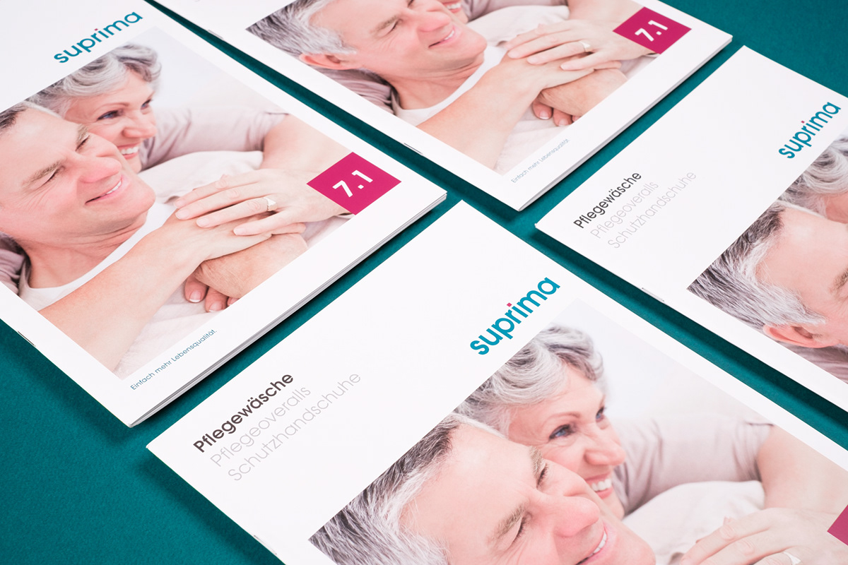
The task was to make the tradition-steeped company look more modern and fresher in communication and to move the purely informative interactions with retailers to a more emotional approach. The claim to the corporate design was not to present care products as a taboo topic, but rather to communicate them as an opportunity for a better quality of life. For this purpose, the new claim "Simply more quality of life" was developed. As part of this, a cross-catalogue concept was created in workshops with the customer. After elaborating the sales arguments, a classification of the products was derived, which clearly communicates the functions already in the table of contents and thus greatly facilitates the choice of the correct care product for the viewer. Categories were developed based on customer requirements to organize the products into logical packages. In order to make the selection products in their respective product group quick and easy, each category has its own cover page. An overarching table of contents also ensures that the selection of product groups is immediately recognizable. This is rounded off by a uniform cover concept that works equally for all product groups.
When designing, care was taken to ensure that the viewer was able to contact the company as easily as possible. Therefore, the catalogue has been optimized for conversion. Technical but nevertheless easy-to-understand product visualizations in the catalogue, lead the viewer to the product with the help of icons - such as visualizations of different versions or zipper variants. An informative legend with a color chart, a size chart and detailed descriptions of the functions and other product groups on the last page of the catalog, ensure maximum user-friendliness. Bright and friendly colors run through the whole concept, so that in all printed articles a consistency in the appearance of the colors is achieved and so the new, modern and emotional communication is ideally reflected. During the postpress processing of the catalog, care was taken to use a backstitch stitching with eyelets in order to be able to order the catalogue depending on resellers needs.
The aim was to develop a catalogue that functions as information and sales material for both medical supply stores and nursing homes. In order to increase the performance of specialist retailers, handy sales support in the form of folders was also developed, which at first glance pick up the needs of the user and lead them to the right product.
Through its harmonious design language and user-friendly design, suprima is portrayed in brand communication as a customer-oriented company with emotional and modern values.